Technology Tips and Tools:
How to Get More Students to Contact Your Studio
Daniel Patterson
MTNA Business Digest, Volume 2, Issue 1
October 2022
There is a lot of advice given about how to get more students for your studio. Many recommendations are offered: Facebook ads, social media marketing, Google marketing, referrals, and even word of mouth. These are important tools for getting people to discover your studio. But, none of them are as important as your website.
Your studio’s website is your most important “student-getting” tool. You can send as many people as you like to your website. But, if that website is not optimized to convert that traffic… your efforts will be wasted. What will increase the effectiveness of your site?
Five Website Rules That Will Increase Your Enrollment
Rule #1: Use a Modern Site Theme Designed by a Professional
For maximum effectiveness, you should use a theme designed by a professional designer. This could be a pre-bought theme or a custom design that you paid to have made for your studio. Avoid drag and drop builders that allow you to build your site brick by brick.
Also, avoid dated looking templates as well as sites created by music software that are an “all-in-one” marketing, scheduling and billing solution. These all-in-one solutions usually look dated and are poorly designed.
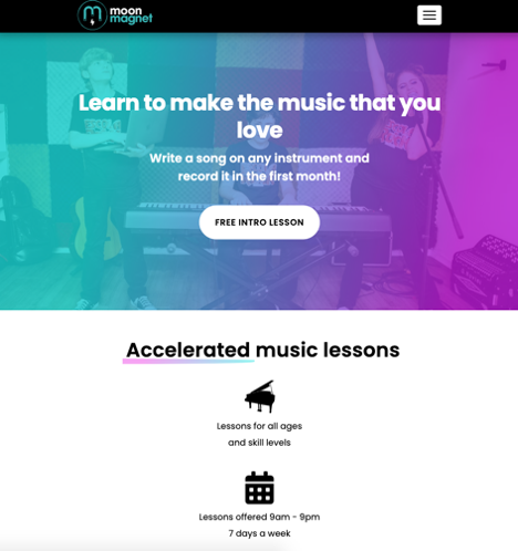
Moon Magnet is a great example of a site that uses a modern, fresh design.
Rule #2: Make Your Site as Small as Possible
French designer Antoine de Saint-Exupery famously said, “A designer knows he has achieved perfection not when there is nothing left to add, but when there is nothing left to take away.”
The same is true for your website. Less is more. Include only basic details about your studio, your location and your programs. Avoid overwhelming your site visitors with details that don’t matter: your background, your degree, your studio policies, your teaching philosophy.
We have found that when we cut all of those elements… studios experience a big jump in the number of people contacting them for lessons. It’s counterintuitive, but it’s true.
This isn’t to say that you should hide your policies or prices. You could include them in your site if it is really important to you. If you do include them, my recommendation would be that they not be put "front and center" or included in your menu navigation. Keep all of the focus on the outcome and results that your students get.
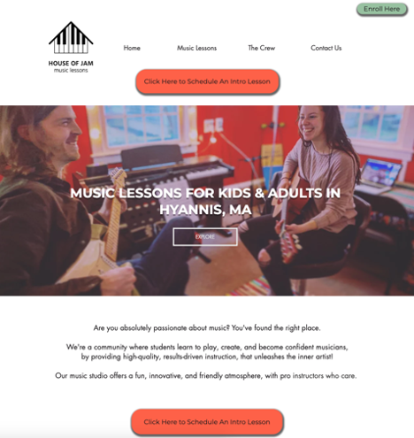
The House of Jam site is a great example of this.
Though this school teaches nearly a dozen instruments…they have less than six pages on their site! They get dozens of leads per month because they get right to the point and clearly state who they are, what they teach and the “big benefit” of working with their team!
Rule #3: Use a Bold Banner with a Benefit-Driven Headline
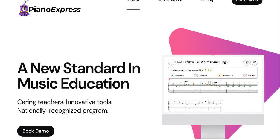
They say you only have one chance to make a great first impression… This is true for your studio, as well. Your headline and banner are the most important part of your home page. Greet people with a bold picture or even moving video like ThePianoExpress.com has for their studio (click here to see a good example of a site with moving video).
And don’t greet people with a platitude like: “Best Lessons in the City!” or “Music Lessons That Are Fun!” Think of a headline that could only be true about your studio. Make a promise about what students will achieve if they join your studio. It takes creativity, but the difference shows in your numbers! Here’s an example from GroupLessons.com that displays Rule 1, 2 and 3!
Rule #4: Include a Consistent Call-to-Action
Many sites have a contact form or a contact page. That’s good! But it’s not enough.
It has been determined that by including numerous call-to-action buttons throughout your site, you will increase the number of people who contact you. Include them on your home page, in your menu, on your internal pages and maybe even as a pop-up or two!
Additionally, we’ve seen the contact rate go up when people include clear instructions on what will happen when they contact the studio. Why does this work? People don’t like the unknown. They prefer what’s safe and familiar.
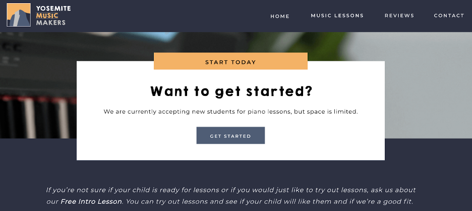
By briefly showing them the process BEFORE they fill out your form, you will ease their tension and anxiety. As a result, they’ll reach out in greater numbers! Here’s a great example from Yosemite Music Makers.
Rule #5: Be Helpful from the Instant They Arrive on Your Site!
Do you know what consumers are looking for when they visit a local business’s website?
It’s not their policies. It’s not their value proposition. It’s not their products or services. Testing and research has shown that it’s much more mundane. Most consumers have very basic questions:
- What are your hours?
- What’s your phone number?
- Where are you located?
And if they can’t quickly get answers…studies show that your site visitors navigate away and visit the site of a more helpful competitor. Therefore, it’s important that you make these basic details visible and accessible on your studio’s homepage!
And a bonus tip—make sure you’ve registered your studio on Google Business, so tyou show up on Google Maps!
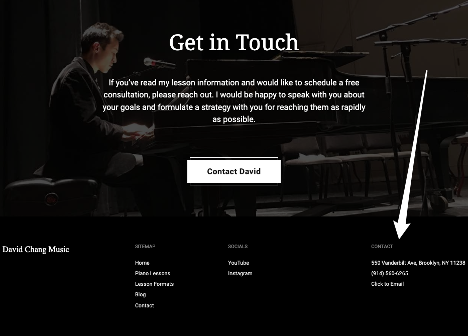
What Happens When You Optimize Your Site?
How do we know these tools work? There are programs that can assist us with finding and interpreting statistics from our websites (Google Analytics being just one). These statistics include how many people have visited the site, how long they stayed, what they viewed, etc. When changes such as the five mentioned above have been made, the statistics show how effective those changes are.
There are really two numbers I look at to determine whether a studio’s website has improved. Specifically, I look at:
- How many more people contact the studio after the website changes have been made
- The overall percentage of site visitors who contact the studio
Here’s an example:
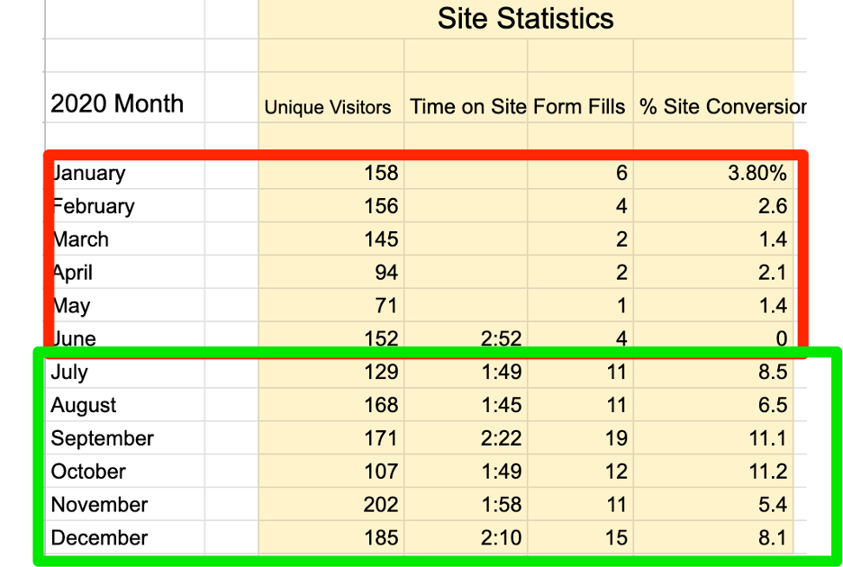
For this particular studio, you can see in the first half of the year that the studio only received 2–6 form fills per month. Their site also had a low conversion rate (the conversion rate is the number of visitors who actually left contact information and became known to the site rather than stayed anonymous). Only 1.4%–3.8% of their site visitors turned into a contact.
However, after they made changes to their site (like the ones listed above), their number of contacts per month jumped to 11–19 contacts per month. Also, you can see that their conversion rate jumped significantly. Between 5.4%–11.2% of their site visitors turned into a contact.
This has become a good site…and the numbers show it!
Conclusion
If you make these changes, more potential students will contact you. And more contacts mean more students or the ability to be more selective about which students you accept. These are just a few basic tactics that you can use to increase the number of contacts you receive each month. Not only are these tips helpful, but they are quick and easy to implement.
If you’d like to go deeper, I recommend looking at this in-depth guide on how to have a powerful music studio website.

Daniel Patterson is a writer, teacher and marketing consultant for music schools. He is the founder and CEO of GrowYourMusicStudio.com and the co-founder and CEO of GroupLessons.com