Technology Tips and Tools:
Web Design with Your User in Mind
Jennifer Stadler, NCTM
MTNA Business Digest, Volume 1, Issue 3
April 2022
A website is essential to every business. But, simply going online isn’t enough to be successful. You also need to provide an excellent User eXperience. In this article, you’ll learn the key principles of UX web design through industry examples and how to apply them to achieve your objective, whether that’s selling your sheet music or filling your music studio.
A UX web design places the user first. This is the core principle of UX design and underpins all of the principles that follow. Take time to define your customer or client and the problem that your product or service solves for them. If you’re a pedagogical composer, your primary customer is a teacher and the problem may be finding music to both motivate students and meet their learning needs. If you’re a studio teacher, your client is a student (or parent of a student) and the problem is finding instruction that aligns with their goals. Get specific with your customer/client definition and keep this at the center of your design decisions.
Principle #1 Intuitive Navigation
Intuitive navigation is important for users to find their way around your website. The easier it is to navigate, the higher the engagement and, consequently, the conversion you want to achieve (i.e. music sales or student inquiries).
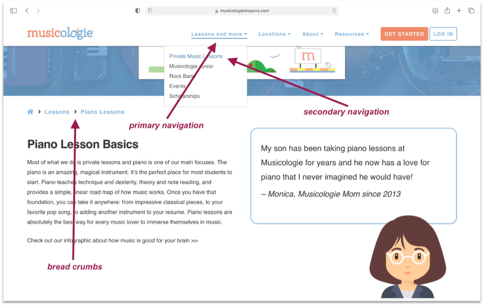
Musicologie is a music education company with an incredibly intuitive navigation system. The company offers a wide variety of services across multiple locations, but their website is organized in a way that makes it easy for users to explore as little or as much as they’d like before enrolling. How do they do it?

The primary navigation menu at the top is organized into four clear categories, with “Lessons and more” listed first (user first). As you hover over each category, a secondary menu appears with more specific subcategories. This process continues as you delve deeper into the site. And, you can easily backpedal to previous locations using the breadcrumbs at the top left of each page or explore new locations via the sticky navigation (navigation menu that remains visible as you scroll). It’s hard to get lost, but if you do, there’s a complete map of the site in the footer.
- A positive user navigation experience starts with a well-thought-out sitemap. Create a sitemap to organize (and clarify) the content that needs to be on your site.
Principle #2 Scannable Content
Most users don’t read content on websites; they scan. With this in mind, prioritize the information you present, with the most important items in the foreground.
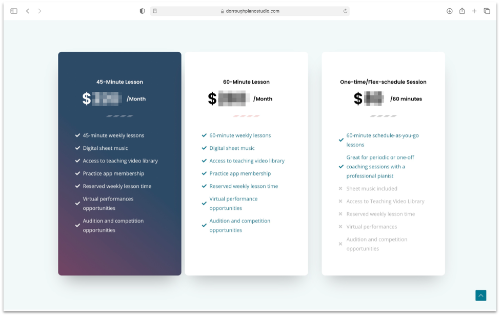
Dorrough Piano Studio provides an excellent example of scannable content. Look at the “Pricing & FAQ” page. Notice that the number of lesson choices is kept to a minimum to simplify the decision-making process: 45-minute, 60-minute or 60-minute flex. The choices are presented in three clean sections with clearly marked prices and bulleted descriptions that are easy to digest (also note the complementary icons and colors). For additional direction, the recommended lesson choice is emphasized by a darker background.

If you need more information, you simply scroll down to the FAQ section. The questions are presented in an accordion making it easier to find the answer you’re looking for. Click through the other pages of Dorrough’s site for additional examples of scannable content including headers, subheaders and multimedia that will improve your user experience.
Principle #3 Attractive Visuals
Not only does your content need to be scannable, it needs to be visually attractive. There are many ways to make your website attractive using visual elements like alignment, colors, fonts, white space and, most importantly, multimedia.
Take inspiration from concert pianist Natasha Paremski.

Web Design by Kevin Sutton
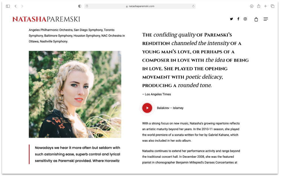
Paremski’s website demonstrates good alignment with clean formatting lines. It has a minimalist black and white color scheme with bold red accents to capture users’ attention. The fonts are legible and used consistently.
- For the optimal user experience, aim for no more than two font families. Use different sizes, weights, and styles for variety.
And, there’s ample white space (empty space of any color) for balance and clarity. The most attractive element of this site is the photography, which perfectly captures the artistic nature of the subject. The photos are high quality and properly compressed for fast load times.
- Speed has an enormous impact on user experience. To optimize your page load speeds, refrain from using unnecessary design elements and compress images to the web standard of 72ppi.
Videos are presented in the form of a pulsing play icon to encourage user engagement and also maintain a tidy appearance.
Principle #4 Calls to Action
A call to action (CTA) is a prompt that encourages users to take some kind of action, such as purchasing a product or filling out a form. It’s usually presented as a button with a command like “buy now” and points users to another location (e.g. shopping cart or checkout page).
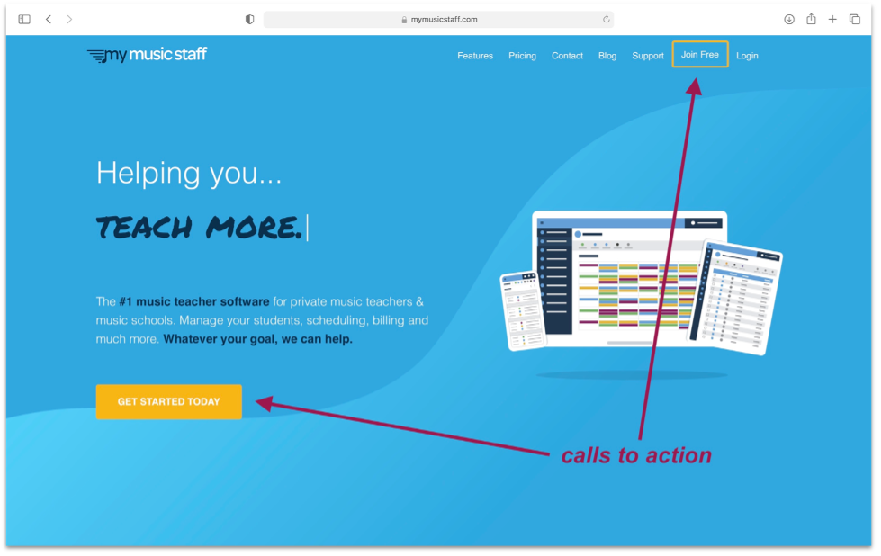
My Music Staff makes great use of CTAs on their music software website, employing them on every page and section. And, in case those are overlooked, they’re also in the header and footer. It sounds overwhelming, but the CTAs integrate seamlessly into the site, guiding the user’s actions.

The commands are carefully worded to encourage user click throughs (e.g. “try it free,” “join free,” “start my free trial”). And, stronger commands like “get started today” are contextualized by words like “30-day trial” and “No credit card required.”
- Some users will go straight for the sale, while others may want to gather more information. Create click paths for both types of user by incorporating hard (“register now”) and soft (“learn more”) CTAs.
Each CTA button contains a hyperlink to a form fill page. The form itself is limited to six, simple fields making it quick and easy to complete.
- When using a form, limit the number of fields and keep them simple. This creates a positive user experience and increases conversion.
Remember that you are not designing the website for yourself, but for your user. So, keep your user in mind as you apply these core principles of navigation, content, visuals, and CTAs. Your user will be glad that you did.

Jennifer Stadler, NCTM, is an independent piano teacher with experience in early childhood, K–12, and higher education. She holds an MM degree in piano performance and pedagogy from the University of Oklahoma.